Software
“Most people make the mistake of thinking design is what it looks like. People think it’s this veneer—that the designers are handed this box and told, ‘Make it look good!’ That’s not what we think design is. It’s not just what it looks like and feels like. Design is how it works.”
Steve Jobs
Before leaving our jobs to pursue Studio Neat full time, Tom worked as a software developer and Dan worked as an interaction designer, so it’s a bit funny it took us until our third product to make an iOS app.
Our first app, Frameographer, was released in March of 2012. It is a simple (surprise, surprise) app for creating stop motion and time-lapse videos on the iPhone. Our goal was to create something easy enough for anyone to pick up and use, yet capable enough to satisfy most users. Perhaps more importantly though, we wanted the app to be fun to use. Our physical products bend towards utilitarianism, so making our first piece of software offered some great opportunities to delight our customers in new ways.
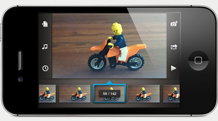
The project view in Frameographer.
An Ecosystem
Ecosystem is a word that gets tossed around a lot, especially in the tech world. In this context, an ecosystem refers to the various products, services, and content offered by a single company, meant to play off one another. Companies like Apple and Amazon have thriving ecosystems, and by buying into one you essentially get “locked in” to that platform.
On a smaller scale (like how we operate), an ecosystem is not designed to lock in customers, but to create a sense of cohesion between products. Everything appears to be cut from the same cloth, as it were.
When we created the Glif, we knew that making stop motion and time-lapse movies was going to be a popular use for our handy little tripod mount. These two techniques require a still, motionless camera, so the Glif was an obvious fit. What we also realized is that while there were plenty of apps in the App Store for creating time-lapse and stop motion movies, none of them were that great. They typically suffered from one of two problems: needlessly cluttered and complex, or lacking certain features and export quality. We hoped to hit the sweet spot: an easy-to-use and capable creative tool.
Designing the App
The first step of any new design project is to check to make sure a fantastic solution to our problem didn’t already exist. We surveyed the scene in the App Store to check out what was available for making stop motion and time-lapse movies. If there was already an awesome app for that in the store, we would not build one. We have limited time and resources, so we only move forward on projects where we feel we can make a significant contribution to the space.
We should probably mention, we chose iOS as the platform without even a second thought. This might seem smug or arrogant to fans of Android, but they can go stick it (only kidding). There are four main reasons we chose iOS:
1) Ecosystem. The Glif is designed specifically for the iPhone 4/4S, and Frameographer was meant to compliment our hardware, so it wouldn’t make sense to design it for a different device.
2) Fragmentation. Android is more fragmented than iOS, meaning it is spread across several different device types, with various screen sizes and internal specs. With the limited resources we have (only the two of us), it made sense to design for the OS that reaches the most people with the least amount of (re)design work. The “bang for your buck” factor, if you will. We even cut down on the fragmentation further by allowing Frameographer to run on only Retina display devices.
3) Monetization. Anecdotal evidence has shown that iOS users are more willing to pay for apps than Android users. This may not remain true forever, but it seems to be the case at present.
4) Familiarity. We have been using iOS since its inception, and we believe familiarity with a platform leads to better design. We’ve become intimately familiar with the UI (user interface) conventions simply by using our phones everyday.
The app we designed comprises three main screens: Home, Capture, and Project. We decided on this organizational structure early on, but each screen went through countless iterations. We also went straight from sketches to pixel-perfect mock-ups. If you’ve ever worked at a design firm it might seem bizarre to skip the wireframe stage, but that’s one of the advantages of making an app with just two people. We don’t have various stages of “approval,” so we can skip some steps.
For an in-depth look at the making of Frameographer, you can read this blog post we put together.
Animated Walkthrough
One unique approach we took in designing the app was creating a fully animated, pixel-perfect UI walkthrough video. We initially did this because we planned to hand the design off to other developers, but it still proved to be useful after we decided against that plan and Tom took over coding responsibilities.
In iOS apps, and in our app especially, animation is a key part of the user experience. Screens slide in and out of transitions, things moves when you touch them, and objects have a sense of physics to them that is hard to convey in a mockup or wireframe. Creating a UI walkthrough video is definitely time consuming, but it can be a useful tool. We actually consider the walkthrough video our first prototype, and showed it to a handful of people to make sure the flows and interactions made sense.
It’s interesting to look back now at the walkthrough video to compare the original vision for the app with what we ultimately ended up making. Although some things remained in place, the final app is dramatically simplified and improved from the walkthrough video, a testament to the iterative design process. The walkthrough video can be viewed here.
Hiring Outside Help vs. Doing It Yourself
When we first started designing the app, neither of us were proficient in iOS development, so our initial plan was to hire outside developers. At the time we were focusing our efforts on getting the Cosmonaut manufactured, so we figured we could fully design the app, and then offload the development work to a couple friends who run a small app development studio.
Long story short: it didn’t work.
Our experience is too specific to make any sweeping generalizations about hiring friends to do development work, or hiring outside help at all. But speaking anecdotally, we have been much happier doing everything in-house, and think the product is better as a result.
Initially, the creation of the app was happening in two very discrete phases: design and development. We designed the entire user experience, provided pixel-perfect, layered Photoshop files, and created an animated UI walkthrough video to demonstrate the flow and animations. All of this was then passed off to the developers, who began building our design. This kind of compartmentalized, segmented design process is not uncommon in many design agencies, but from our limited experience, we think the product suffers when following that process.
Design and development are intertwined, and they feed off one another. Separating the two prevents serendipitous discoveries from occurring. Furthermore, it is simplistic to assume a piece of software can be fully designed, and then sent off to a land of magical development where all your app dreams come true. Questions will arise, technical challenges will occur, and the back and forth between design and development is critical to working through these.
Ultimately, Tom learned Objective-C and we brought the project back in-house. The biggest advantage of this, of course, was the tight melding of design and development. We were able to fuss over every tiny detail, and quickly iterate new ideas.
What we’ve learned from this is that it’s best to do things yourself whenever you can. Even if it requires learning a new skill, in the end it will be worth it. It might seem like a big deal that Tom picked up Objective-C, and it kind of was, but it was something that was within reach. There is generally no harm in taking the time to learn something new, and often times it will pay off handsomely in the future.
What’s In a Name?
Naming products can be a fun exercise. New projects start to feel tangible and “real” when they are given a proper title. The importance of a good product name is obvious, but in time any meaning fades away and it simply becomes a symbol for the product. Take the iPad, for example. Remember how many people hated the name when it was introduced? “It sounds like a feminine hygiene product!” (kids can be so cruel). Fast forward a couple years, and no one thinks twice about it.
For our iPhone app, we settled on the name “Frames” quickly. It sounded nice, spoke equally to time-lapse and stop motion techniques, and had a style that fit nicely alongside other Apple apps (e.g., Numbers, Pages).
Two days after launching the app, we received an email from the CEO of a company called Tech4Learning, which makes Windows and Mac software for the educational sector. Incidentally, they too had an app called Frames, which is for—you’ll never guess—creating stop motion animations. It had been around since 2006.
Hearing about the existence of this app, although in a different domain, was a real punch in the gut. We were backed into a corner, and it was completely our fault. Although we did our due diligence in checking the Apple App Store, we failed to consider the reach of trademark across domains. A simple trademark search would have revealed that “Frames” was already taken.
After some hemming and hawing, we realized that the only reasonable course of action was to change the app name. So, after even more deliberation, we picked “Frameographer.” Although we really loved “Frames,” we have grown to love “Frameographer” as well. The fact that it is a unique, invented word also offers some advantages, including our ability to “own” it, in a matter of speaking.
Obviously it’s not ideal to change the name of a product after it’s out in the wild, but in this case we didn’t have much of a choice. Fortunately, we learned that this change wasn’t as big of a deal as we feared.
The Icon
The design of an app icon is one of the most important parts of the app. Not only does it occupy a prominent chunk of real estate on the user’s home screen, it is the primary way an app is represented in the App Store. The easiest way to signal to a potential customer, “hey, this app is high quality,” is to have a well designed, high quality icon.
We went through dozens of iterations before we finally arrived at a design that made us happy. It was the part of the app we were fussiest about, and nearly lead to the dissolution of Studio Neat (not really).
We started off by having a graphic designer friend take a pass at the icon. We didn’t give too much direction, other than showing her the UI of the app and giving her a few napkin sketches of icon ideas. We liked where we ultimately ended up, but after sitting with it for a few weeks we thought we might be able to improve upon it, so we both continued sketching our own ideas. After being unsatisfied with where that netted out, we decided to bring in the big guns and hired The Iconfactory. When everything was said and done we’d produced about 50 different icons.
Some of the Frameographer icon designs. Final design is on the right.
It might seem silly to spend this much time and attention on a 114x114 pixel square, but as stated before, the app icon is incredibly important. If you don’t feel comfortable making the app icon, hire a graphic designer to make it for you. People do judge the book by the cover, so make a nice cover.
Numbers
So, how did we do? We thought it would be interesting to reveal our app sales numbers, to give an idea of how an app like ours, with the publicity it received, does in the App Store.
We sold 9,179 copies of Frameographer in the first week, 2,457 on the first day alone. We received some great press on the first day, including posts from TUAW, Macstories, Shawn Blanc, and Benjamin Brooks. At its peak, Frameographer reached #55 in the overall Paid rankings, and #5 in the Photography section. Four days after we launched, our app was featured by Apple in the New and Noteworthy section of the App Store, and was moved to What’s Hot the following week.
Our second week netted 4,488 sales, and the week after we had 1,775 sales. As you can see from the graph, our sales continued along this classic long tail shape.
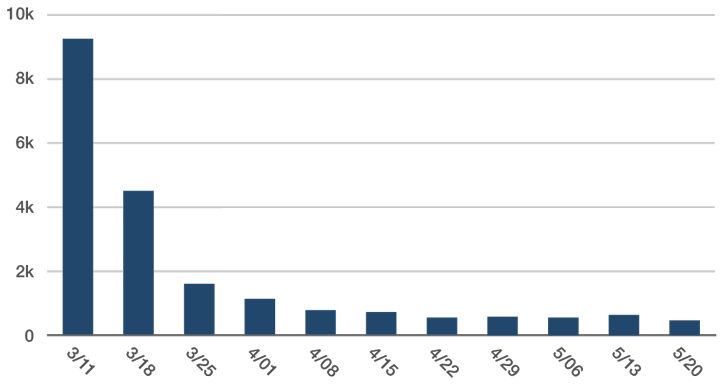
Frameographer sales in the App Store.
Another interesting (and perhaps unsurprising) tidbit we learned: keywords in the app title matter. For the 1.3 update, as an experiment, we changed the app name from “Frameographer” to “Frameographer - Stop Motion & Time-Lapse.” In the search results for “stop motion,” we jumped in ranking from 31st to 1st; likewise, a search for “time-lapse” jumped us from 25th to 5th. As a result, our sales effectively doubled, although this bump in sales was also a result of some outside press. It also appears that the algorithm Apple uses for search ranking is constantly being tweaked, as our ranking tends to fluctuate.
By numbers alone, these sales look great, but our app is only $2.99 (which is actually high by App Store standards). Subtract Apple’s 30% cut, and Frameographer alone would not be enough income for the two of us to live on if it was our only source of revenue. In our case, that wasn’t our goal or intention, but it should be kept in mind if you are an aspiring app developer with dollar signs in your eyes. Obviously, results may vary, as all apps are unique and beautiful snowflakes. These numbers are simply provided as a reference point.